Material Motion in Flutter
On February 21, 2020, the Flutter team launched the Flutter animations package as part of Google’s Material Design motion system. This package lets Flutter app developers implement commonly used animations and transition patterns in their apps much more easily than before.
Material motion is a set of transition patterns that assist users to understand and navigate an app. It is pre-canned animations for commonly-used effects. You can tweak the animations with your content and place them into your app to amuse your users.
- Add animation package to your package’s pubspec.yaml file:
dependencies:
 animations: ^2.0.3
2. Import the package in your dart code
import 'package:animations/animations.dart';It now supports four different transition patterns. The following transition patterns are defined by material motion:
Container transform
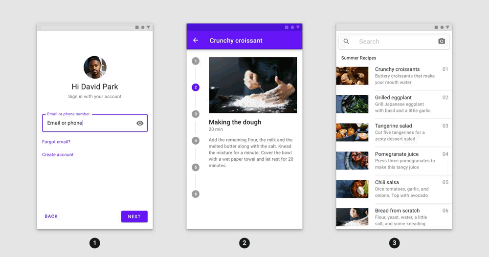
The container transform pattern is designed for transitions between UI elements that include a container. This pattern creates a visible connection between two UI elements. Container transform is implemented in Flutter using the OpenContainer widget. It transitions between two child widgets seamlessly so that they appear to be the same widget. This widget operates like any other widget in flutter, allowing you to easily insert it into your application and take advantage of the complex animations it gives you.
Here are what some of OpenContainer’s properties do:
openBuilderis the function that is called when theOpenContainerwants to obtain the child for its open state. Likewise, theclosedBuilderdoes the same but for the closed state of theOpenContainer. The actionCallbackgiven to both builders can be used to open and close the containers respectively. We use the actionCallback,openContainer(), given to theclosedBuilderand pass it to ourInkWellwidget'sonTap, so a tap on theInkWellcan trigger an opening of the container.openColoris the background color of the container while it is open, while theclosedColoris the background color while it is closed.closedShapeis the shape of the container while it is closed, similarly there is alsoopenShapethat defines the shape of the container while it is open.closedElevationis the elevation of the container while it is closed, andopenElevationis the elevation of the container when it is open.- During the transition the container transitions between open and closed properties in one smooth animation.
- You can alter the transition duration as well as the transition type. The ContainerTransitionType.fade value overlaps the widgets in a cross fade; the ContainerTransitionType.fadeTrough value staggers the widget fades so that they do not overlap.

Examples of the container transform:
- A card into a details page
- A list item into a details page
- A FAB into a details page
- A search bar into expanded search
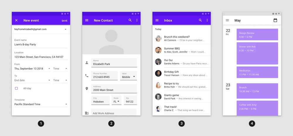
Shared axis
The shared axis pattern is used for transitions between UI elements that have a spatial or navigational relationship. This pattern uses a shared transformation on the x, y, or z axis to reinforce the relationship between elements. It is implemented in Flutter using the SharedAxisTransition widget.
SharedAxisTransition has the following properties:
fillColor: The color used for the background during the transition.animation: The animation driving the child's entrance and exit.secondaryAnimation: The animation that transitions the child when new content is pushed on top of it.transitionType: Choose between scaled, horizontal, and vertical types of shared axis transition.child: The widget transitioning in and out.
Examples of the shared axis pattern:
- An onboarding flow transitions along the x-axis
- A stepper transitions along the y-axis
- A parent-child navigation transitions along the z-axis
Fade through
The fade through pattern is used for transitions between UI elements that do not have a strong relationship to each other. Fade through transition is implemented in Flutter using the FadeThroughTransition widget. This widget applies a fade transition to the outgoing element and a fade and scale transition to the incoming element.
This widget has the following properties:
fillColor: The color used for the background during the transition.animation: The animation driving the child's entrance and exit.secondaryAnimation: The animation that transitions the child when new content is pushed on top of it.child: The widget transitioning in and out.
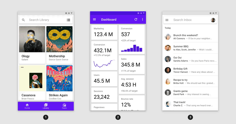
Examples of the fade through pattern:
- Tapping destinations in a bottom navigation bar
- Tapping a refresh icon
- Tapping an account switcher
Fade
The fade pattern is used for UI elements that enter or exit within the bounds of the screen, such as a dialog that fades in the center of the screen. It is implemented in Flutter using the FadeScaleTransition widget. Entering elements fade in with increasing opacity and scale from 80% to 100%, while exiting elements fade out with decreasing opacity. It is only applied to entering elements to emphasize new content over old.
Here are what some of it’s properties :
animation: The animation that drives the child’s entrance and exit.child: The widget transitioning in and out.
Examples of the fade pattern:
- A dialog
- A menu
- A snackbar
- A FAB
